Evangelising & demonstrating the efficiency & value of UX / Interaction Design (IxD) to functional leaders, changing the perception on what UX was to key executives in the orgs
Staff hiring and skill-set around UX & IxD had been through a massive upgrade since
Superior rate of frequency & quality of usability testing became a showcase for all teams to raise the bar
Led the UX & interaction design for the wide group of stakeholders from 9 countries– from requirements gathering to conceptual designs via Design Thinking & Goal-directed design methodologies
Led the UX managers in Europe providing fact-based User Research
Led workshops to flesh out the required context scenarios & requirements
Coordinated Lean UX workshops – resulted in UX-led cloud product with early prototypes tested with real users 3x faster than normal
The absence of Interaction Design (IxD) was the biggest gap found in the current process & skill-set in the teams. It was to be an up-hill battle when projects were commonly led by Tech project managers who viewed UX as graphic design.
Steering the company culture from ‘Big design up-front’ habits and turning to ‘Big learning up-front’ was fundamental…
Note: The above company culture was one of the biggest challenges.
Lead by Example – Focus on Human needs
Evangelizing the distinctions between UXR (UX research), IXD (Interaction design), VXD (Visual Design) and how they flow into each other
Lean UX: Explain & show how the process works with Rapid Learning is incorporated throughout the whole process & repeats within agile – via Rapid Prototypes as experiments, iterate with quick-turn-around test results with cross-functional teams
Gradually weed out legacy expectations of waterfall process with design
Explaining & showing when & when not to involve UX
how does UX / interaction design flow into UI design?
Click on image to enlarge
The above chart illustrates the role & responsibility UX serves, especially at the start of the project. The challenge was to insert this practice into a company culture where it was not defined nor it was practiced. It also shows the delta where UX & UI meets and close collaboration is required.
Progressing from Market segments to Proto-personas
Prior to this project I had invested 6 months leading the training program for UX leads of the 9 countries. It covered best practices & methodologies with Proto-personas & ethnographic research
All UX Leads from the countries were asked to produce proto-personas for their markets and were responsible for gathering data within thier own countries’ markets
Each countries’ persona data were compiled and synthesized into 5 key persona boards as arch-types for the whole of Europe based on common characteristics
We had to do a complete overhaul of our persona boards based on User research based on User goals & behavioral patterns. Previously the User persona generation was outsourced to an external agency which had approached it with a market research mind-set. They were heavy in demographic generalizations which served little value today, especially after 5-years have past since.
Persona boards are not 1 & done exercises. They are rather operational tasks.
To always keep up-to-date as new data comes in, replacing assumptions with facts, visible to all colleagues.
GETTING STARTED WITH PROTO-PERSONAS
- Use Empathy Workshops to gather assumptions & facts and to map them
- Key declarations being goals, motivations, frustrations
- Fill out boards with different coloured notes for assumptions from facts
Using proto-personas
- Yellow post-its = Assumptions / place-holders
- Blue post-its = Facts
- Updated daily by UX team
GET OUT OF THE BUILDING - INTERVIEW
- Use the draft profile to recruit & interview real User candidates (aim for 15-30)
- Replace the assumptions with real facts gathered gradually on the boards
- Develop User models based on findings
MODEL & PRIORITISE FOR FOCUS
-Synthesise as a group and develop User models based on findings
- Prioritise the top personas as Primary, Secondary personas for focus
MAKE VISIBLE, ALIVE & UPDATED REGULARLY
- Place the boards in a highly visible & accessible location for everyone
- Keep updating the board continuously as a living document
For complex software projects such as this Persona boards help orgs as key guides in efforts of genuine empathy with target Users.
Quite often, having secondary & customer personas (who are non-Users but are ones purchasing the product) are useful. Read more on Proto-personas.
Workshop Sessions On Current & Future Journey Maps
Across the 9 countries, we had gathered cross-functional colleagues from product, infrastructure, tech, customer service to workshop sessions (virtually due to COVID ). In those sessions, we have absorbed the collected data summary and discussed their primary & secondary personas
Current state User journey map was mapped out to flesh out key touch-points which were common across the countries while country-specific nuances were also discussed
Synthesis & patterns were worked out based on common User goals & needs which led to a shared understanding across all teams involved. By doing this, we were all aligned & practicing User centered design
At the end of the day, a re-play & summary of the insights were shared with the whole workshop participants
Mapping User Goals As a Starting point
For Future Journey Maps, we’ve started with Goals of Users which align with business goals. Then an optimistic yet feasible ‘near-future’ ideas were generated
Considering current trajectory of existing products & services, their influence was factored in as well, based on target outcomes
The quick, time-boxed exercises have generated plenty of opportunities for stakeholders to participate in shared understanding of what needs to be created, and prioritize them collectively on the fly.
The key effort from UX (as facilitators) was to show Human-Centered Design process by blending the right amount of User goals with business goals to engage business colleagues.
CURRENT-STATE
JOURNEY MAP
As a starting point, we’ve established a shared understanding of the As-Is customer experience via a workshop session creating the:
MAPPING OUT THE CUSTOMER JOURNEYS
Key lane:
Mapping pain-points & emotional component of Users
CURRENT-STATE JOURNEY MAP
FUTURE-STATE
JOURNEY MAP
Thereafter,
We’ve explored tomorrow’s journeys applied to the same context scenarios via:
A strategic design & alignment tool for visualising business and customer experience strategy.
Focusing on what & why we want our customers do, think, and feel when experiencing a product or service.
- Keeps the focus on User(s)
- Drive strategy with business & User goals aligned
- Isolate anticipated pain points to mitigate
- Extract and articulate a vision
- Align teams & control power dynamics
KEY BENEFITS
- Phases & key touch-points mapped
THE BUILDING BLOCKS APPLIED
- The scope was immense, it was sliced up for better focus per session. Multiple sessions were required
- The large group of the multiple countries’ cross-functional colleagues were grouped into 3 break-out teams, working on assigned User goals, context scenarios to map out the their journeys
FOCUSED WORKSHOPS RUNNING SIMULTANEOUSLY
- Common patterns & ideas were consolidated with group synthesis at the end. This also provided shared understanding with all involved.
- Play-back & summary of the insights were shared with stakeholders who were non-participants (in workshops) for feedbacks.
CONSOLIDATE INTO 1 BOARD AND PLAY-BACK
Articulating the Problem / Opportunity
Synthesizing the inputs from workshop participants & articulated into words
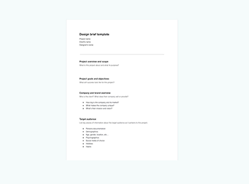
Design brief was drafted as a target goal to achieve – a shared understanding with everyone
Having a single source which clearly articulated the “What” we were looking to create & deliver to “whom” was a key milestone output
Within 1 workshop session, there was clarity as to what was a “recipe” to the ideal experience to deliver for the project. Those ingredients of the recipe were stated in point form within the brief, and were supported with workshop artifacts as to “Why“ that was.
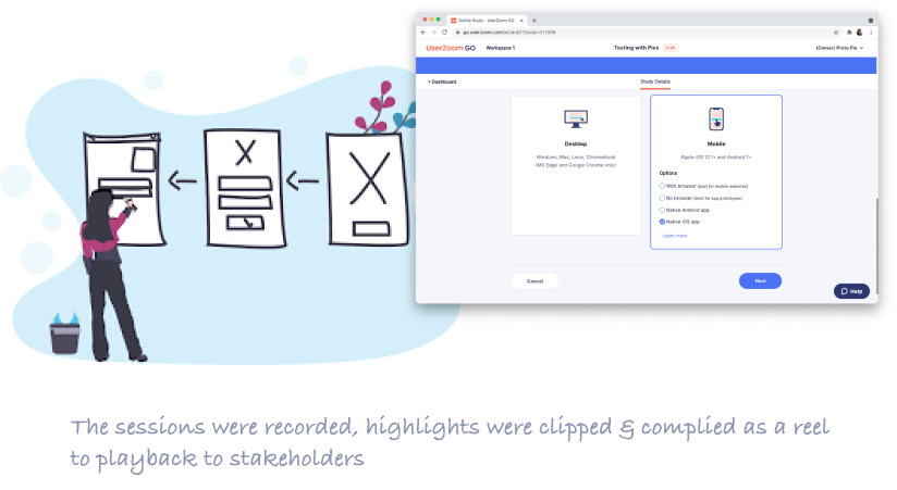
Playing back results & findings from workshop sessions to stakeholders who were outside from the workshop teams and gathered their feedback
Everyone understood the “What” was to clearly to achieve.
The next step was to explore the “How”.
Albeit a draft and still open for iteration, this version of the brief offered everyone a target to strive for in many facets.
Since the key stakeholders were involved in arriving to this point, we had eliminated excess time wasted on traditional requirements document which can take weeks & months to prepare.
Back-stage actors
There were tech stacks of systems & applications to consider. This phase where our tech leads were called on to go deep & narrow to flesh out the constraints & parameters which the project needs to consider.
Quite often the tech constraints clashed with the usability & business strategies. For this, it is imperative to map out and declare those needs & business rules in an open discussion.
On the front-stage, colleagues from customer service & business transformation / infrastructure were keen on easing the common pain-points experienced in the past.
UX research had shown in several countries that “set-up and pay for service” was an area where Machine-learning & smart systems can become a game-changer.
Long-winded On-boarding & set-up processes were leading to painful UX for First time Users. The goal was to avoid this in the future.
Differentiating experiences from First time Users & regular Users – on-boarding, setting up…
Online (and real-time) collaborative tools like Miro enabled colleagues who were not co-located in the same office to be able to sketch & share easily.
Many were non-designers to take part in ‘ideation’ & co-creation facilitated by the designers in the various groups.
Exploring the solution space via Remote Studio
Cross-functional colleagues in co-creation workshop virtually – facilitated by UX designers
Design brief was reviewed & desktop research undertaken by all to bring artifacts as sources of inspiration & discuss why they were adding value
Various concepts were sketched out & presented to group with 1 chosen by all in the workshop
The lo-Fi designs were iterated based on feedback from group
Where possible, key screens were roughly created into Rapid prototypes with tools like InVision.
REMOTE STUDIO
- Workshop with cross-functional colleagues: everyone sketches rough concepts
- High-level ideation & time-boxed
- Considering for the First-time Use experience as a start
- Interaction / UX designer facilitates the group - Highly exploratory
- Focused on high-level User flow & User goals
- Visible to all to review & pitch in
Working Lo-Fi (Low Fidelity) enabled working with velocity and being able to adopt immediately the ideas generated within the collaboration workshop
PERMISSION TO FAIL
Everyone was encouraged to explore, sketch & contribute without judgement.
Before the end of the session, Rapid Prototypes were also created in InVision to help teams visualise the UI & the User flow with clickable screens.
Interaction Design (IXD) to progress Wire-Flows
Lo-Fi designs enhanced to be Med-Fi designs with time from UX
Rapid Prototypes were also updated with Med-Fi designs and progressed interaction solutions to ensure the experience was meeting User goals, following IXD principles
Leads from Tech & product, infrastructure were consulted in the developing of the concepts, many drafts were iterated based on feedback.
Wire-Flows communicate efficiently on the User experience. They are the blueprint for the customer journey on all possible paths available including edge-cases in interaction.
All possible paths mapped out with User goals & technical constraints & feasibility in mind always...
DESIGNING THE EXPERIENCE WITH WIREFLOW
First-time Users have different needs than habitual Users. Good on-boarding was essential.
CONSIDERING THE "FIRST-TIME USE" EXPERIENCE
Ability to design, then view all of the states, dependencies, parameters is vital. It communicates the UX to not only the designer himself, but to the partners in tech for input.
BLUEPRINT FOR VARIOUS STATES & MICRO-INTERACTIONS
Usability Test – Round 1
Using the Proto-personas mapped, we recruited real Users fitting the profile
WireFlows translated into Rapid Prototypes in InVision – as clickable screens
Usability testing (un-moderated) were done to validate approaches for 3-4 key experiences in the User journey
Feedback from Users from the sessions were used to enhance the designs for several iterations & tested again
Results were presented to Leads from Tech & product, infrastructure
Fail Early, Fast, Often, and CHEAP!
If we were going to fail, we wanted to do that way early in the process (than later in development).
UX Plan & Roadmap Shared with Stakeholders
Once there was buy-in from all of the key stakeholders across the countries, the project had wind in its sails. More than 9 key Context Scenarios mapped out from workshops to cover in UX
Breaking up the work into small chunks with key milestones mapped out for the whole year & beyond
Mapping of time & resources required for different disciplines in the process of IXD, VXD & testing
Planning was shared & refined with feedback from Leads from Tech & product, infrastructure, shuffling of tasks & timeline based on priorities from planning meetings
UX should be seen as a partner to Tech & Product, and NOT a sub-set to their own roadmaps.
Ramping Up the Design Team
More XD designers were recruited with specialized skills in IXD & VXD respectively to handle the workload. On-boarding & training the team was essential for them to participate in User research & testing
1 front-end developer was added to the UX team to serve the role of “Creative Technologist” to assist in creating custom HTML & javascript Prototypes
1 UX intern was added with focus on Quantitative analytics & tooling for the project – whom I’ve also mentored & trained
Iterating IXD (in Med-Fi) with Usability Tests
Context scenarios & use cases were mapped with further workshops & requirements extracted from them From First Use to recurring use journeys & IXD were done following the individual requirements for each context scenarios & use cases mapped
Designing for humans means designing with error-prevention in mind. Giving Users the ability to auto-correct their mistakes is fundamental in Interaction design, especially at this stage in the process.
DESIGNING HAPPY PATHS, ALT. PATHS. EDGE CASES
With Rapid Prototypes in Med-Fi, designs were quickly put into testing with Users to understand what works & what doesn’t.
TEST, FAIL, LEARN, IMPROVE, AND REPEAT...
Written specifications on rules & behaviours on the micro-interactions from UX. This is essential for production.
WRITING INTERACTION GUIDELINES
First Time Use & Mobile First quickly became new catch-phrases within the orgs as a key experience to address well.
Rounds 5-6 in Testings with Users
Each context scenarios, use cases, edge cases were mapped out in WireFlows & RP
The RPs were tested with fresh panels of test participants and iterated with feedback for maturity
Fail Fast & Early – experiences which added value to Users were kept while ones which did not were changed or removed
Each failure meant lessons learnt – cost effective & fast as they were done early
Stakeholders were invited to particpate via observations & summary of results were regular
Heuristic assessments were done to ensure usability principles were applied. Users must be able to recognize & learn quickly with ease.
Device Agnostic Responsive Prototypes
A front-end developer was invited into the UX team and had daily meetings and workshops to uncover common use cases & edge cases. This worked wonders as the silos were taken down and enabled the developer to think creatively to solve problems. Thus the title “Creative Technologist” rather than a front-end developer was our title for him for the project.
During the collaboration, we’ve uncovered the unforeseen interaction challenges with the Customization feature where Users build their own dashboards. The coded prototype (in Med-fi) help shine a spot-light to glaring issues with responsiveness & varying screen dimensions. Rules & helpful constraints for usability were reviewed, tested and applied.
Working in med-fi enabled the front-end developer to focus on the interaction without getting distracted with unnecessary visual details at such a critical stage in design development.
For example, providing the affordance of User customisation of a dashboard while keeping it responsive to multiple devices took plenty of trial & error.
CODED PROTOTYPES
- Isolating edge-cases from rough working prototypes with speed allowed the whole team to isolate “blind spots” and address them without delay
- Helped answer many doubts in usability testing where static ones could not – iterating a technical Proof of Concept for superior UX
- Kept the quality of the experience great while not taxing the system to break.
KEY BENEFITS
As the Interaction designer (IxD) here, working closely with a technologist with an open mind to make comprises where required was key. Co-creation of rules & behaviour was the remedy for many challenges which entails with projects delivering advanced customisation.
CLOSE COLLABORATION
The dynamic & device agnostic prototypes were highly useful in gathering feedback from Users in usability tests. This gave plenty of boost of confidence for the design team to progress as well as the dev team.
DAILY IMPROVEMENTS & ITERATIONS
It was key in fleshing out interaction edge-cases & even typical use cases where static screen prototypes were too limited…
Having advanced customisation being one of the key features to deliver, it clashed with fluid responsiveness most Users expect in using web apps. A good level of responsiveness in mobile, tablet, laptop, and desktop was essential.
These prototypes were tested in various devices & screen dimensions which unearthed many unexpected challenges to address in interaction.
Visual Design production adapting to IXD & Prototypes
With IXD & prototypes maturing usability working with Med-fi graphics, it was time to commence visual design for the final ‘skins’ of the product
Working closely with myself & IxD designer & ‘creative technologist’ in the team (a front-end developer as part of the UX team), Visual designer started creating patterns & components which are aligned to the company brand & its design system
Much of the visual designs made it into the mature prototypes for usability testing to validate
VxD (Visual design) had a big role to play in the responsiveness feature of the product which had mobile view as a key use case throughout the User journey
Testing the End-to-end Experience
I had coordinated the training, preparations, and lead the tests with the UX team – live moderated test with working prototype end-to-end journey from sign-up process to First-use
Highlight reel of video clips for easy consumption for stakeholders’ reviewFeedbacks / insights from Users were used for future feature ideas adding more value
Moderated tests are Ideal to test End-to-end journeys to find any gaps in UX.
Particularly in milestone stages for products used in multi-platform, multi-channels.
MODERATED TESTS LIVE!
All of the design team got involved including even the UI/ Visual designers to cover multiple scenarios.
MODERATED TESTS PREPARATIONS
- UX Team & invited stakeholders to debate and vote on top questions we want to have answers to
- Any controversies from stakeholders to clarify any doubt
- Key validation on hypotheses to mitigate risks
ALIGNMENT ON WHAT TO LEARN
It was critical that we worked from the same script of questions & test materials to have clinical objectivity across test results
THE SCRIPT & TEST MATERIALS
- Moderator leads the interview while we had note-takers in support
- Stake-holders were optionally invited to view the sessions as silent note-takers
- Sessions were recorded for clipping and for creating highlight reels on key findings with face & mouse interactions from test participants
MODERATOR & SUPPORT ROLES
Whole team got together to synthesise the findings & converge observations. A great way to debrief & have a shared understanding on the outcomes.
SYNTHESIS OF RESULTS / COMMENTS
Synthesis of the data gathered from each sessions together with all test moderators & observers to arrive to conclusions on the findings
Moderated tests provided us access to real Users with more time to understand them, and help us validate/invalidate key doubts.
Test results kept the UX team grounded. Feedback on our hypotheses on what works on usability humbled us sometimes order to make good design decisions.
Hand-over to Dev & translating the design
35 developers & 8 QA colleagues were assigned to tackle the project in development– all of them have benefited from having the designers provided outputs on the IXD & VXD provide the translations on use of the designs & provide ongoing support
Toughest challenge – QA, Dev were unaware & untrained to best practices in collaboration with UX. Growing pains were expected frequently
A cultural change was taking place while everyone were all not co-located in the same office, continent, time-zones. To remedy this, the tech leads were invited to design end-of-sprint reviews consistently as well as designers being available in the Dev’s reviews.
Regular check-ins with Dev & tech leads was needed to communicate & isolate the gaps between the designs delivered and what was being coded.
Assets & Guidelines to the Design System For Re-use
All of the interaction design flows, user journeys, Prototypes & rules, UI patterns were ready to be shared with the countries’ own local teams
The documentation & components/templates made available to all teams in Europe looking to adopt the the solution for their projects
Enablers of re-using patterns & components without starting from scratch, and leverage the lessons and insights gathered from the project team with User research & usability tests
Enabled European countries to have that consistency across the brand for the same solutions they were looking to offer to their local markets
Co-opting QA was also key as they saw value in UX’s artifacts of Context scenarios & use cases already articulated in Design sprints.
Adding Quantitative research to Qualitative
Quantitative research required In-App behavioral data of 6 months from the product being made public –the right priming & setup was required
As part of the UX roadmap, the Machine Learning specialist in the UX team interviewed & collected the business needs from the top 3 countries ‘ orgs. This report was used to seek & assess the prospective vendors such as Pendo & Amplitude to enhance our quantitative data gathering
The technology we look to leverage in getting us data needed to be aligned with the goals of cross-functional colleagues especially in product, marketing & sales.
In-App behavioral data collected in the background of a live product would provide an extra dimension on usability to UX teams (and orgs) to add on top of qualitative data they gather from research.
1 /
1
1 /
1
1 /
1
DISRUPTION
IN THE INDUSTRY
Innovative startup companies offering superior UX were disrupting the FinTech industry especially in the segment of cloud-based Software As a Service (SaaS).
They were rapidly winning market shares from the traditional giants, Wolters Kluwer being one.
WK’S COMPANY
BACKGROUND
For professional services, a 184-year history
180+ countries. Operations in 40+ countries
19,200 employees worldwide
€4.6 billion in revenues- 2020
99% OF COMPANIES LISTED IN FORTUNE 500,
100% OF FORTUNE 100 LISTED COMPANIES
ALL USE WK'S SERVICES...
SaaS FOR TAX ADVISORS Serves professional clients who are accountants or accounting firms from small middle, and large enterprise businesses.
Expert solutions with keen domain knowledge of the tax & accounting domain
PROJECT MISSION - To create a cloud-based platform which serve customers to solve their business problems in the tax & accounting sector
- To facilitate WK’s European division's (9 countries) stakeholders from multi-disciplinary functions in realising their needs in UX
- To design it as 1 solution to be leveraged by all 9 countries as a common base.
SILOED SYSTEMS Historically the company has been specialised in desktop apps with on-premise local systems. Creating cloud applications was uncharted territory.
Each local systems need to change fundamentally in order to connect to cloud networking. It had fallen behind its competition in cloud services while demands from the market & clients were increasing day by day.
CHALLENGES
CHALLENGES
DIFFERENT PRODUCTS, Each of the 9 organisations were years in development (yet to launch) with different product portfolios for the same market demands across Europe, lacking a common strategy path.
SAME BRAND. This varied & inconsistent brand & customer experiences had no future.
THE “BIG DESIGN
UPFRONT” COMPLEX CHALLENGES
Tech/product departments have designed the UI historically. The UX function was widely seen as graphic design or Ul at best.
Low UX maturity was apparent and was the biggest obstacle in producing desirable products ahead of competing brands which were UX-orientated already.
VIEW CASE STUDY THE "BUILD TRAP"
THE COMPANY CULTURE OF ORGS DESTINED
TO DESIGN BAD SOFTWARE
‘GROUP THINK’ ON FEATURES LIST FROM PRODUCT MANAGEMENT
STEP 1:
(NOT CONSULTING UX) MOCKUP THE UI & START CODING ASAP
STEP 2:
BYPASSING INTERACTION DESIGN INTEGRATE WITH OTHER SYSTEMS
STEP 3:
ADDING MORE COMPLEXITY CALL IN DESIGN TO SPRINKLE “UX MAGIC”
STEP 4:
(TO CHECK OFF ON THE LIST) LAUNCH
STEP 5:
AND REPEAT STEPS FOR NEXT PROJECT NOT INVOLVING UX IN STRATEGY. POOR USER ACCEPTANCE
END RESULT:
USABILITY ISSUES ARE TOO GREAT & LATE TO FIX NOW.
KEY MIS-STEP HAD OCCURRED IN STEP 1. SOURCE: EXPERIENCE DYNAMICS WHY THE "BUILD TRAP" LEADS TO FAILURES SOURCE: EXPERIENCE DYNAMICS