Case Study
Wolters Kluwer, Tax & Accounting Europe
Thought leader for UX in TAA
Lead Interaction designer
Head of UX, Cloud Strategy Operations
The absence of Interaction Design (IXD) was the biggest gap found in the current process & skill-set in the teams. It was to be an up-hill battle when projects were commonly led by Tech project managers who viewed UX as graphic design.
Steering the company culture from ‘Big design up-front’ habits and turning to ‘Big learning up-front’ was fundamental…
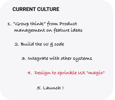
Note: The above company culture was one of the biggest challenges to face. It was a path we couldn’t afford to take anymore, moving forward.
Previously the User persona task was outsourced to an external agency which treated it like market research with demographic generalizations which served little value today, especially after a 5-year shelf life.
Persona boards are not one & done exercise, rather an operational responsibility to always keep up-to-date as new data comes in , replacing assumptions with facts, visible to all colleagues.
For complex software projects such as this Persona boards help orgs as key guides in efforts of genuine empathy with target Users.
More reading on creating Proto-Persona boards can be found in this dedicated blog post on the topic.
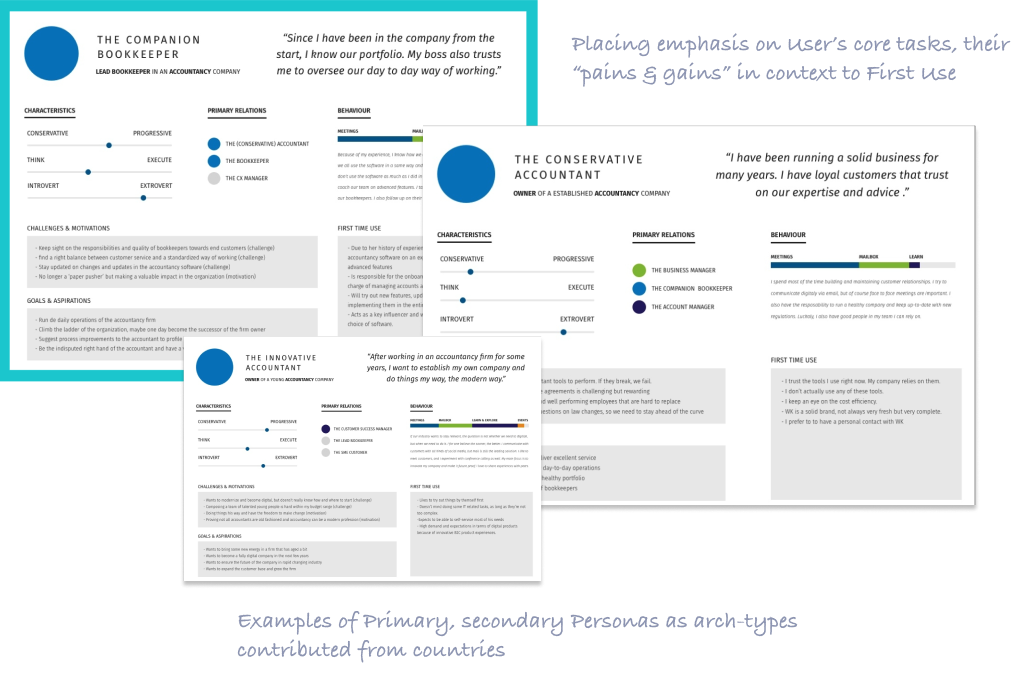
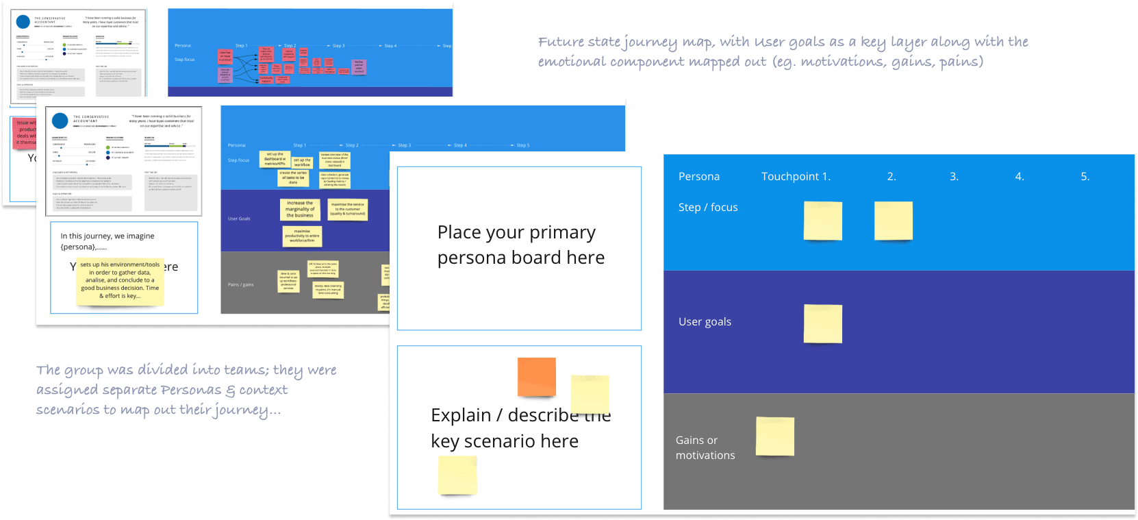
The key effort from UX (as facilitators) was to show Human-Centered Design process by blending the right amount of User goals with business goals to engage business colleagues.
Albeit a draft and still open for iteration, this version of the brief offered everyone a target to strive for in many facets. Since the key stakeholders were involved in arriving to this point, we can eliminate excess time wasted on traditional requirements document which can take weeks & months to prepare.
At high level, the brief had 3 key promises or deliverables for the User – 2 of them focused on quality of usability while 1 was to help drive profitability.
Everyone understood the “what” clearly to achieve; the next step was to explore the “how”.
There were tech stacks of systems & applications to consider. This phase where our tech leads were called on to go deep & narrow to flesh out the constraints & parameters which the project needs to consider. Quite often the tech constraints clashed with the usability & business strategies. For this, it is imperative to map out and declare those needs & business rules in an open discussion.
On the front-stage, colleagues from customer service & business transformation / infrastructure were keen on easing the common pain-points experienced in the past. Long-winded On-boarding & set-up processes were leading to painful UX for First time Users, the goal was to avoid this in the future.
UX research had shown in several countries that “set-up & pay for service” was an area where Machine-learning & smart systems can become a game-changer.
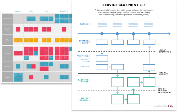
Online collaborative tools like Miro enabled colleagues who were non-designers to take part in ‘ideation’ & co-creation…
Differentiating experiences from First time Users & regular Users – on-boarding, setting up…
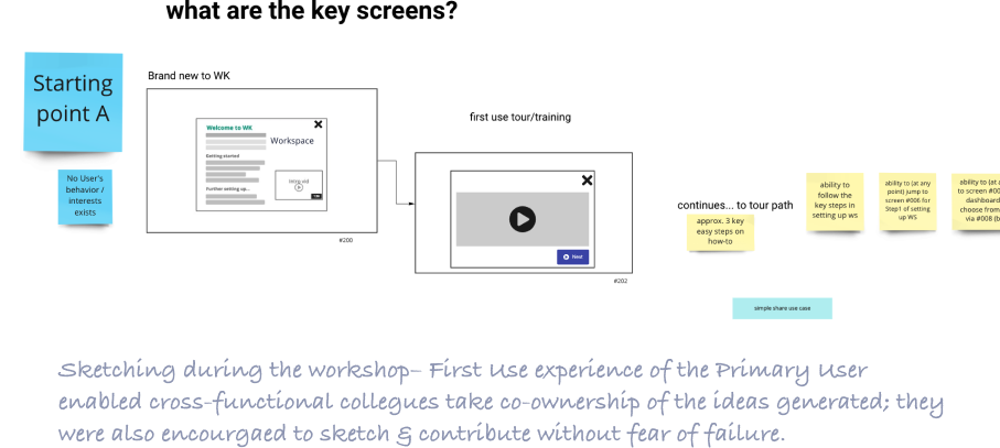
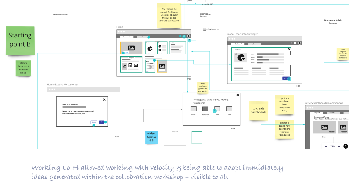
Mapping out when & how Users will create their Dashboards, and how they’ll populate it relevant content themselves…
Before the end of the session, Rapid Prototypes were also created in InVision to help teams visualise the UI & the User flow with clickable screens
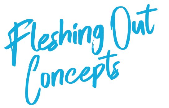
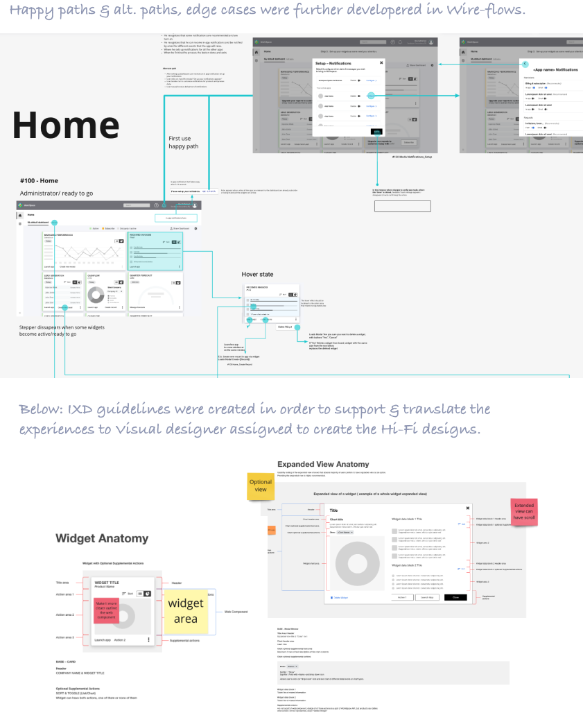
Wire-Flows communicates efficiently on the UX & the blueprint for the customer journey on all possible paths available including edge-cases in interaction.
Fail Early, Fast, Often, and CHEAP!
If we were going to fail, we wanted to do that way early in the process (than later in development).
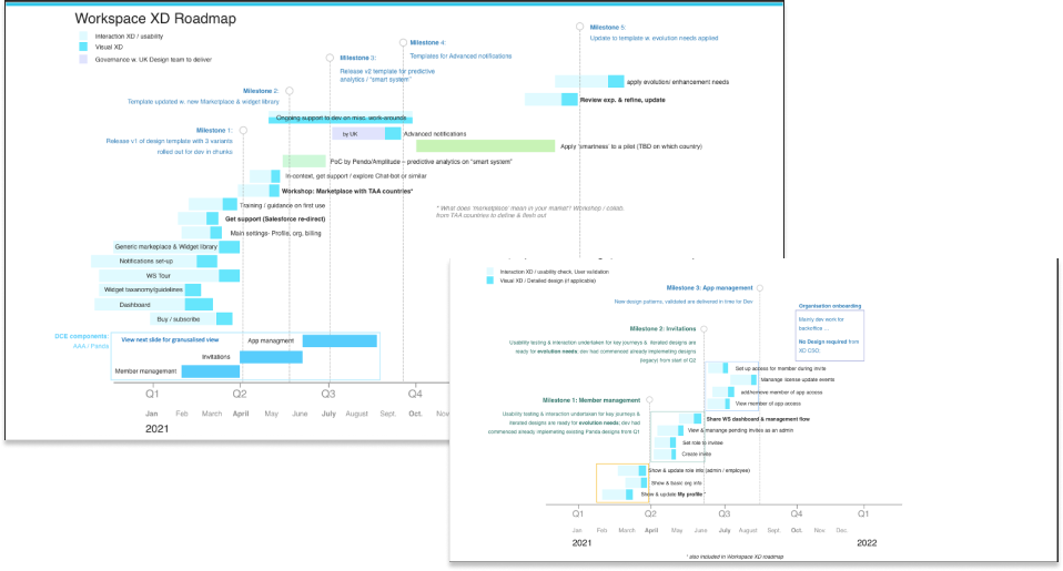
It was strange for some stakeholders to see a roadmap from UX as they’re thinking from a legacy culture mindset…
UX should be seen as a partner to Tech & Product, and NOT a sub-set to their own roadmaps.
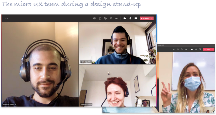
Context scenarios & use cases were mapped with further workshops & requirements extracted from them
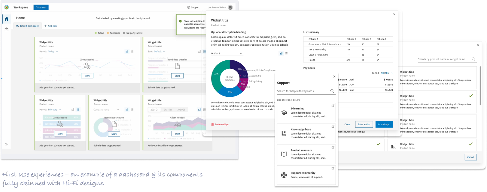
From First Use to recurring use journeys & IXD were done following the individual requirements for each context scenarios & use cases mapped
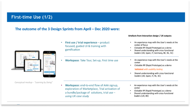
First Time Use & Mobile First quickly became new catch-phrases within the orgs as a key experience to address well.
Heuristic assessments were done to ensure usability principles were applied. Users must be able to recognize & learn quickly with ease.
A front-end developer was invited into the UX team and had daily meetings and workshops to uncover common use cases & edge cases. This worked wonders as the silos were taken down and enabled the developer to think creatively to solve problems. Thus the title “Creative Technologist” rather than a front-end developer was our title for him for the project.
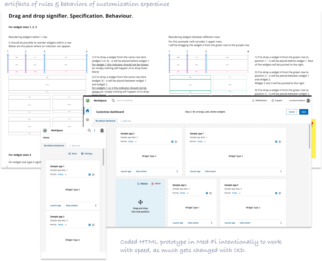
During the collaboration, we’ve uncovered the unforeseen interaction challenges with the Customization feature where Users build their own dashboards. The coded prototype (in Med-fi) help shine a spot-light to glaring issues with responsiveness & varying screen dimensions. Rules & helpful constraints for usability were reviewed, tested and applied.
For complex software design, having Lo-Fi coded prototypes was key in fleshing out interaction edge-cases & even typical use cases where static screen prototypes were too limited…
Guidelines for coding & rules, constraints on the UI were created for best usability.
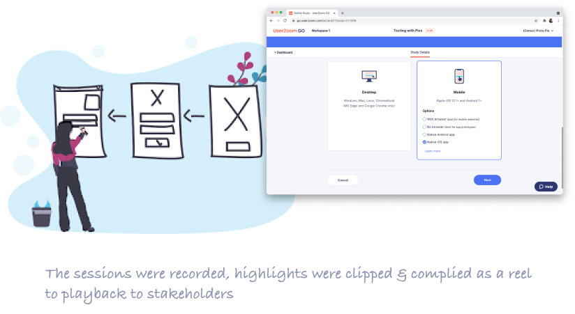
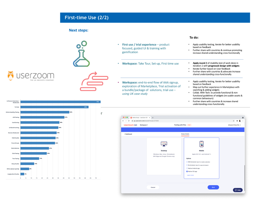
These prototypes were tested in various devices & screen dimensions …
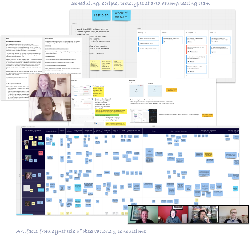
Validated key doubts, hypotheses on usability in order to make good design decisions
Synthesis of the data gathered from each sessions together with all test moderators & observers to arrive to conclusions on the findings
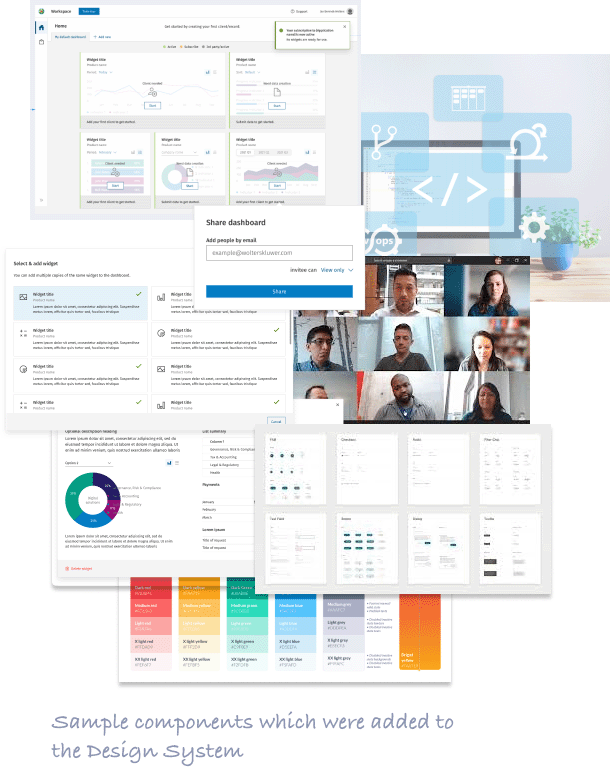
Regular check-ins with Dev & tech leads was needed to communicate & isolsate the gaps between design & Dev.
Co-opting QA was also key as they saw value in UX’s artifacts of Context scenarios & use cases already articulated in Design sprints
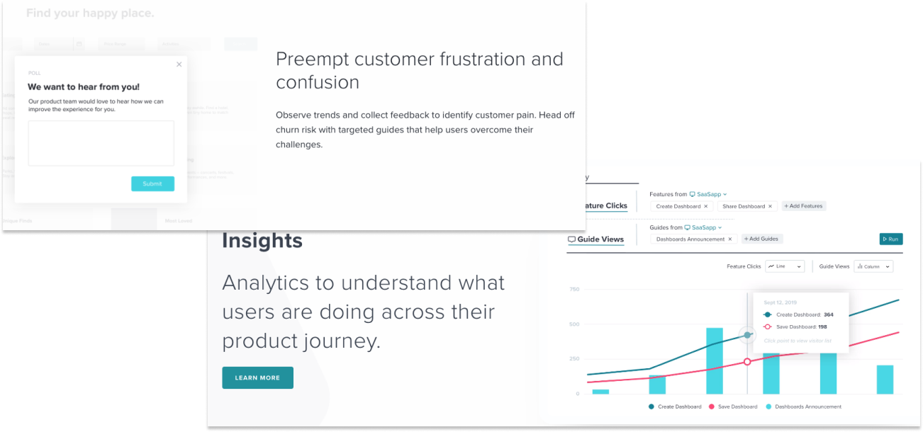
In-App behavioral data collected in the background of a live product would provide an extra dimension on usability to UX teams (and orgs) to add on top of qualitative data they gather from research.
