Case Studies
Sage
Senior UX architect
Sage is the world’s largest supplier to small businesses in accounting software with 6+ million customers, operating in 23 countries. Since it’s founding in 1981, it’s focus was to provide to develop estimating and accounting software for small businesses. The entrepreneur or the “1-man band” is at the heart & soul of the company.
Sage’s web application for small businesses to manage their accounting effectively had served the market well across the board. Sage was now ready to tackle the pre-accounting tasks which entrepreneurs struggle with, such as managing receipts for expenses while they are out in the field. An extreme majority of small business owners still operate in “The shoebox” mentality where all receipts are thrown into a box until it’s time for the yearly visit to the accountant.
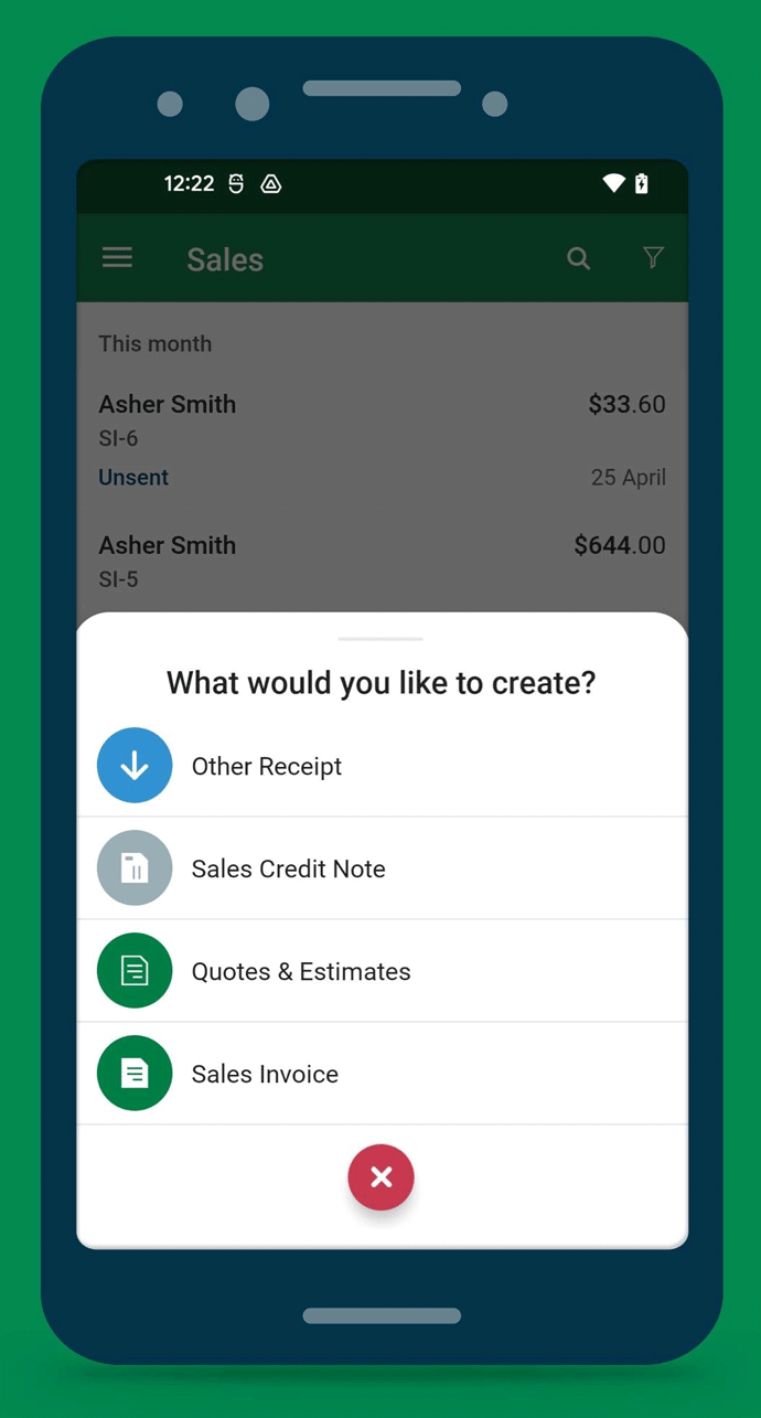
To create a companion app for entrepreneurs while they’re working on the field, out of the office. To enable him/her to take control of collecting and sending the receipts/expenses to his accounting software (web app). Other key features entail generations of quick estimates/quotes as well as sending an invoice all from the smart phone (iOS/ Android).
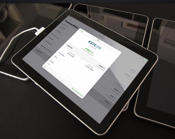
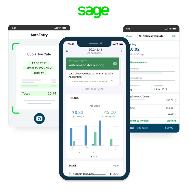
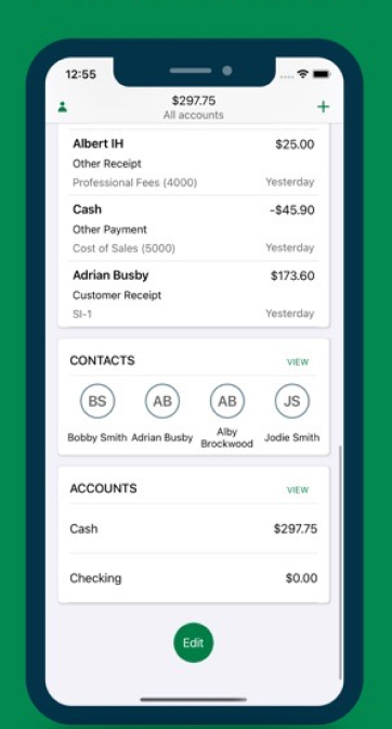
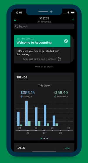
Sage’s Accounting is a mobile app for iOS & Android to serve sole traders & small businesses. It enables them to easily manage their finances as a companion app to the cloud solution to manage expenses, quotes & invoices. It’s a business at-a-glance in the palm of your hand. It aims to be the preferred solution for small business owners around the world.
Starting with stakeholder interviews with product managers and customer service executives, mapping and prioritising the key motivations & pain-points of users were the first step.
The entrepreneur, the 1-man-band, persona had the below concerns:
Hence the app aims to achieve the below User goals:
Users are able to take photos of receipts, use them to scan and extract the digital data to send to synced book-keeping systems.
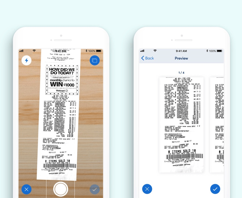
The interaction design challenge was meshing the native camera function experience with the OCR technology which was provided by a 3rd party supplier. The key obstacle to overcome was the scenarios where the OCR tech would misread the scanning and output wrong details which is problematic to users.
Enabling users to review and correct the digital entries was key in the solution.
To create a seamless experience, taking good care of the edges cases was imperative for this project.
The sync requirement between the web app (book-keeping system) and the mob app meant UX had to consider all edge cases for the intermittent break in service, web connection failure, and providing offline mode.
Taking close attention to Apple’s best practices in iPhone devices, to enable interactions that support the way people usually hold their devices. For example, it tends to be easier and more comfortable for people to reach a control when it’s located in the middle or bottom area of the display. It’s especially important let people swipe to navigate back or initiate actions in a list row.
This also extended to the design system we had created to follow closely the minimalistic & muted design which Apple had documented well in its HIG (Human Interface Guidelines).
Sage’s corporate color green was used with purpose & intent. The visual design was predominately dictated by Apple’s guidelines while there were frequent instances where we extended with new component which was project-specific.