Case Studies

web business Revamp with focus on usability

image of way to stay website in monitor and iPad
Company

Way To Stay

 
My Role

UX Content manager, head of department

 
Background

Way To Stay, being one of the leaders in the industry, offered short-term rental accommodation in Europe. Catering to 6 languages, 21 cities in Europe, and over 5000 boutique apartments,  it stood out from competition in offering authentic local experiences in travel stays.

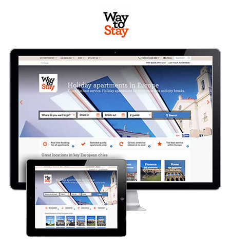
The business was 100% online with its customers search &  match their travel accommodation needs in the internet. Since its maturation from the start-up days its business website had become impractical for SEO / UX purposes and antiquated due  its rapid growth & popularity in recent years.


Project mission

The business goal was to execute a major overhaul/revamp of the website with modern usability principles to attract, serve, and  retain its customers.

My UX content department consisted of 14 content writers I had managed to create engaging content & descriptions of all of the apartments (and their cities) that is user-friendly and web-friendly.


Challenges
  • The portfolio of 5000+ apartments/properties had required new  content under the new consistent style of writing & content – this was no small task while still serving daily operations of the business which often was chaotic
  • Serving to 6 languages meant catering to the countries’ nuances & customs while keeping a certain level of consistency. A standard  translation of the content was not sufficient in order to achieve the level of engagement it aimed for.
  • The UI design & IT development were progressing in parallel while the teams were not co-located in the same office/country
  • The majority of the content team had little or no experience with usability or usability principles
  • Many were creative writers or translators with varying styles (often nuanced to a country).  For example, Latin American Spanish uses different words and terms than European Spanish)
 
 
Solution / action
  • I’ve coordinated and led the workshops sessions to align the writers on usability fundamentals & being User-centric for web interactions
  • Frequent workshop sessions on sharing the User persona data & customer journeys and contextual awareness for each blocks of copy to be written
  • Each language would have a lead writer to align the team. For example, mainland French-speaker would lead French, European Spanish-speaker for all of Spanish content. The same people would be participating the usability test sessions held, proof-reading the copy to the design they were created for.
 
 
image of way to stay website in monitor and iPad

ux writing is unique from traditional copy-writing

As a UX writer, writing copy for web devices such as websites, tablets, and mobile phones requires consideration of various factors such as the device screen size, user behavior, and the purpose of the website:

  • Websites: Keeping in mind that users are typically looking for specific information, so the copy needs to be concise and easily scannable. Headers, sub-headers, and bullet points to break up the text, and writing in a conversational tone to engage the reader was essential. Also were the clear calls to action that guide the user to the desired next step.
  • Tablets: Tablets offer more screen space than mobile phones, but less than desktops. Therefore, its copy should strike a balance between being concise and providing enough detail. Use visuals such as images and videos to enhance the message, and considerations to touch-friendly interactions such as swiping and tapping were key.
  • Mobile Phones: Mobile devices have limited screen space, so its copy needs to be even more concise and scannable. Use of short sentences and paragraphs, and simple language were critical. Use of font sizes that is easy to read on a small screen, and making sure any links or buttons are large enough to be easily tapped with a finger were essential. Also, features such as push notifications and location-based messaging to enhance the user experience were considered frequently.

Writing effective copy for “scanning”

Studies have shown that approx. 80% users don’t actually read websites, they SCAN them.

Users of web & mob devices scan through the text to find the information that they’re looking for, and may fixate on a small section only. It’s important to understand scanning patterns and design for them, in order to navigate users to the most important information.

Some of the most common patterns are shown below – F Pattern, Z Pattern, and Layer Cake.

image of F pattern of how users scan

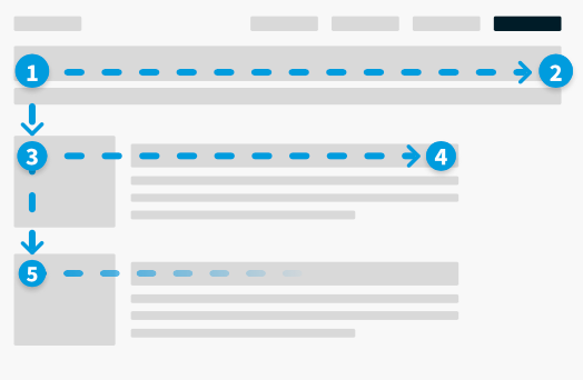
The F-pattern is a common behaviour in which users focus on sections with headings and content, allowing them to find the information they are looking for quickly.

image of Z pattern of how users scan

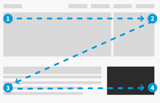
The Z pattern is typically how people’s eyes travels across page when content is lighter. This is rationale for most marketers wanting to place the “Call-to-action” button or copy in that spot marked (4). It is less predictable and can cause fixation or skipping of content.

image of layer cake pattern of how users scan

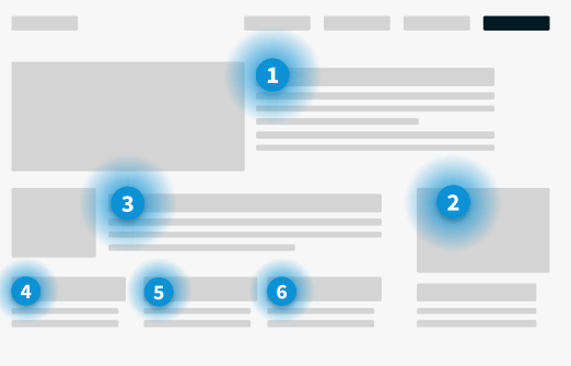
The Layer-cake pattern: A more efficient pattern in which users focus on sections with headings and content, allowing them to find the information they are looking for quickly.

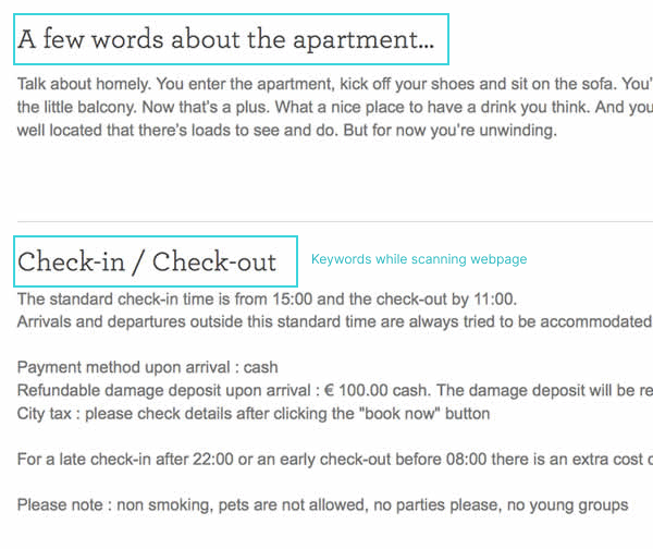
Below are some examples of the copy we’ve created.

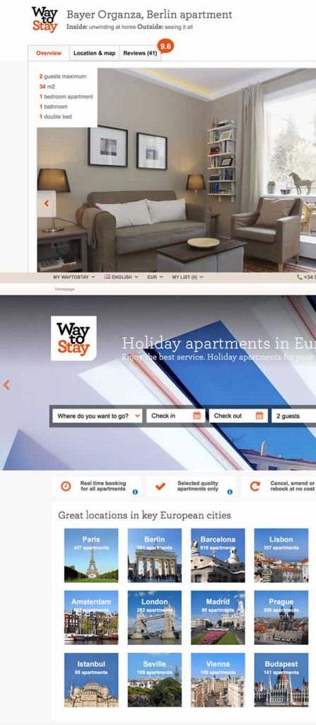
Descriptions of the apartment can be more conversational, informal, and with colorful descriptions to entice the imagination.

Key trigger words which Users will be looking out for are “Check-in/check-out” while they are scanning the page. Those information are essential in getting across clearly and without ambiguity.

sample copy , taxonomy of copy

tone of voice of the brand

The Unique Value Proposition of the company was simple: Planning a holiday & travel is supposed be a fun & full of rich experiences. Way To Stay is going to work to ensure this happening for the customer.

To achieve the goal of having a consistent experience under the unique target values of Way To Stay, a Tone of Voice (TOV) guide was required consistent with the new content the company was generating.

  • Tone of Voice guide is a document that outlines the personality, style, and tone of a brand’s communication. As a UX writer, there are several key components that go into creating a comprehensive Tone of Voice guide for a brand:
  •  Define the brand personality: The first step is to define the brand personality by identifying the key characteristics that reflect the brand’s values, mission, and vision. This includes identifying the brand’s voice, style, and tone.
  • Define the audience: The next step is to define the brand’s audience by identifying their characteristics, needs, and preferences. This includes identifying the brand’s target demographics, their communication preferences, and their language.
  • Develop a writing style guide: This includes outlining the brand’s preferred grammar, punctuation, and syntax usage. This ensures consistency and clarity across all communication channels.
  • Develop a tone guide: This includes identifying the brand’s preferred tone of voice, which can range from friendly and conversational to professional and formal. This ensures that all communication is aligned with the brand’s personality and resonates with the target audience.
  • Provide examples: Providing examples of how the brand’s TOV should be used in different scenarios helps to ensure consistency and clarity across all communication channels.
  • Test and iterate: Once the TOV guide is created, it’s important to test and iterate the guide to ensure that it’s effective in achieving the desired communication goals. This involves soliciting feedback from stakeholders and making adjustments as needed.
image of sample campaign by Way To Stay

By following these steps, a TOV guide was created which ensured consistency and clarity across all communication channels, reflects the brand’s personality and resonates with the target audience.

image of UI of Way To Stay website