The more I learn about web & mobile users I reflect back to my parents & the quirky things they used to do. Some decades ago when I was still living with them, one night after work they came home really excited with a new purchase— a VCR with a bar code scanner. They’ve enthusiastically explained to me of its unique function by grabbing the TV guide and demonstrated the concept to me: the mini scanner inserts the barcode of the TV show from the TV guide magazine and programs it into the VCR to record on its own. “No more fumbling around with the complicated settings to record shows -how great is that?!” So they thought, as I remember never seeing it work actually. The driving concept of the product though (and my parents’ enthusiasm for it) is similar to what most users feel – it frustrates us to having to learn new things like read a manual to do the functions we want, we have tunnel vision when we are looking for something, we tend to be forgetful and lose interest if it’s not easy. So if a mini-scanner would help my parents avoid the step of learning how to program a VCR to record tv shows, they were ready shell out the extra cash for it.
I want get on with it NOW. No manuals pleeeease!
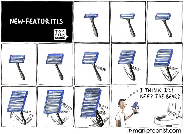
We are creatures of habit as humans, we don’t like having to learn new ways to do things. Once users have found a way to do something, even if it’s not the best way, they’ll tend to do it repeatedly. Having to read a manual to do something as simple as programming a device to record a TV show for example, it frustrates us to have to do so. This is a key point to remember when creating an update to an existing system. Existing users will be frustrated having to learn something new to execute tasks of old (e.g. new navigation when the old one worked just fine for me). If there’s a change in the menu or interface, there’s better be a good enough reason for it otherwise we’d have plenty of annoyed users to deal with.
Less typing, the better
An interesting stat: Approximately 50% of mobile users choose to log in via social networks in order to avoid having to type in text and remember countless passwords. The reason is simple, we get frustrated having to type with small screens and use our fat fingers as they create misspellings — have you ever tried filling out a simple form on your smartphone? forget it, it’s a terrible experience. Users would without a doubt, prefer little typing involved for mobile-targeted sites.
“Banner-blindness” is incurable
Here’s a heads-up for designers: Beware when placing elaborate graphically designed pieces into useful areas of the website. Results from studies of eye-tracking of users tend to avoid settling on any area which can be commercial banners—literally turning a blind eye to not notice banners or anything like it. It’s common habit of most users especially on smart-phones as we are bombarded with advertising when we are focused on finding what we are wanting that moment. What do we do? We ignore them, miss them all together.
Tunnel vision- we ALL HAVE THIS as users
If you have a specific task or goal for your visitor to execute, best to put the call-to-action or button exactly where the users would expect for it to be, otherwise they’d missed it from having tunnel vision. The simple fact is, users will not read the whole screen and will not notice things unless it’s where they expected. Same applies for labeling things or naming categories. Don’t make them pause or think for even a second. An example from a recent round of usability testing showed that only 2 out 8 participants successfully found the target link (when it was right next to a text article).
So then, from our habits as users covered in the past post of “Key Behaviors of Mobile & Web Users Part 1” and the behaviors covered here, what does all this tell us? If we can get the message across quickly and easily (e.g.. we will save you time from not having to read a manual to program your VCR!) people will pay attention…albeit for a short window. I remember my dad tinkering with the VCR & scanner for 20 minutes and eventually quitting when he couldn’t get it within that time-frame. He had expected for it to be much easier, plug-and-go type of thing but things weren’t set up for him enough—the buttons were not located where he expected and the remote control was foreign enough where the motivation to learn a new system did not win over the desire to use the new VCR. Thinking about it now, I’m quite sure if the VCR system had used a familiar navigation as a base and had added some new minor things, it would been a success. It’s a lesson I’ll always remember for UX.


