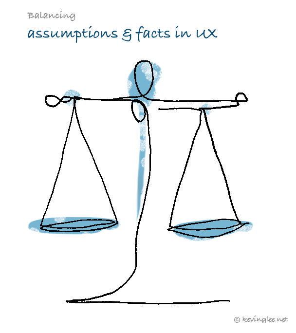
It’s one thing to say that UX practitioners work only with facts and are unwavering on a path to uncovering truths and nothing else. The reality can be much more complicated. In real scenarios, we need to know when to leverage assumptions to our advantage. And to decide on which grey areas to validate to be true/false, as time & resources are finite.
A smart approach would be to articulate the differences between assumptions & facts at the very start of the process. Both types of input can be used in the right situations to assist in uncovering truths into insights for the org.
Common issues & traps

Typically every org has a SME (Subject Matter Expert) who has the gravitas to his/her opinions on the industry. They also may come in the forms of Business Analysts or PMs who’d say “I use to be the customer (persona) myself for 20 years” and “know what they want”. Their input is valuable to absorb as a starting point but we in UX need to take them with a pinch of salt also. The key word in that statement is “used to be”. The world trends can quickly change from a single event in a fast-paced connected world. eg. As the COVID pandemic did for the entire world’s markets and industries.
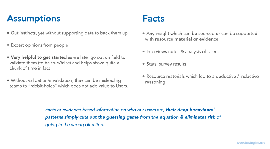
The opinions of our SMEs and PMs can be mostly on their past experiences and often can be classified as “assumptions” especially if they are projected to make generalisations, which works against UX. The challenge is then, how to navigate around the political risk of unintentionally alienating colleagues? By not taking their opinions as facts (but as assumptions) can create tension as some may view it as undermining their expertise. The term “assumptions’ can be received as a negative so it’s best to define them and indicate their value and at which point in the process. View the below chart (Diagram A-1) further down the article.
Avoid the traditional focus groups as the key source of feedback
It’s not uncommon to see orgs arrange focus group sessions where power users from the bigger companies are invited into the org and spend hrs together to obtain user feedback. This may work well for many industries ( eg. screening movies before they release to the mass public) but for software development, it’s not applicable. A seasoned UXer would say that this is a sure way to contaminate data and sway the opinions of the group with bias in favour of the strongest personality in the room. The pitfalls of “Group Think” here is the biggest flaw with this method (read more about Group Think in article here). Then how do we gently break the news to them that we can’t use them as facts? (Which is to be interpreted surely that they’ve been doing it wrong). Focus groups may be useful if used in conjunction with other research methods but high risk is inherent when it’s the sole source of user feedback.
Confirmation bias by the designers themselves

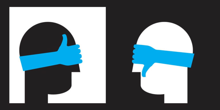
Designers can be under various degrees of pressure to provide winning designs consistently and this can also work against the goal of being evidence-driven. The subconscious self would be wanting validation that the design works and it’s “loved by users” while best practices echo the need in regarding failures as key insights to improve. That it’s great to fail repeatedly, especially early in the process. Easier said then done, and subconscious bias happens more regularly than most would think.
To ensure to avoid this trap, it’s best when the designer who’s worked on the design is not the person conducting the test. Having a colleague or a dedicated researcher handle the test is ideal for achieving clinical objectivity. Confirmation bias can be so prevalent that even the test scripts & questions can be leading the witness subconsciously. In short, having a support network to apply the test preparations from start to finish (in testing) is bound to provide better results.
Having the mindset that “failures are good” as part of the process
In my own experiences, confirmation bias is a real thing and a humbling factor for designers. Once designers get past the failure threshold and the ill-conceived stigma for failures (being a negative when it’s the opposite) it propels their designs to become exponentially superior in usability and be user-centred. The key mantra is to be ready to “kill our darling (designs)” when there are paths for better ones to be unearthed.
Define assumptions & facts, when they are useful, and why

At the very start, define the parameters of assumptions vs facts. And state which situations or segments of the product development process they are useful in and why. For example, assumptions are great starting points when creating personas to map out before recruiting people to do interviews. They help flesh out which questions to ask and where to focus on to validate/invalidate. The rule of thumb here is that assumptions are set at the start of the process to filter out truths from them while facts should be dominating the segments near the end of the process.
Lead by example with clinical objectivity
Labeling all ideas as hypotheses (until proven valid) does level the playing field.
Veteran UXers know in a tricky situation, would answer challenges with a “yes you’re right, but…”. Rather than debating or dismissing controversial opinions/ideas, keeping an open mind consistently would be more prudent. For example, jotting them down as hypotheses among many others in the same board can help keep the pace moving forward. Labeling all ideas as hypotheses (until proven valid) does level the playing field. In a workshop, having the group vote on which best warrants to test (and which ones to be shortlisted) allows for everyone’s ideas to get heard as well as enables controversial discussions to be brought forward early (rather than later).
Rapid learning evaluative research to validate or disprove that idea allows us to sleep well at night knowing that we’ve done our part in staying on the path of evidence-based design. This displays a methodical process people will eventually appreciate and understand, and eventually embrace as good practice. When they do, they’d become your best allies in UX.
Fact-driven decision making

Following the evidence also means making decisions on design based on the facts/results from the test results. Occasionally it will surprise people and humble teams, but facts do not lie. It sets controversies to rest and enables teams to invest in the right path forward. For our colleagues in business, it adds value via risk mitigation in a process-based method instead of getting stuck in differences in opinions subjectively. It further validates our discipline in UX as behavioural science, separating it from graphic design. Not being afraid to fail and being humbled frequently with facts is inherent in our work.
Make the processes accessible for re-use
Documenting the methodologies in steps which are repeatable and consumable for designers and non-designers alike is investing in the future. This allows for a smoother run the next time the workshops roll around with better alignment on what, why, who, and how we approach problem-solving. This is also useful for new designers joining the team to get on board.
The same practice can be said about documenting the processes in User research, the design process from interaction design to hi-Fi visual design processes. Now we are in the realm of DesignOps and how this investment is going to help you run the UX dept with less turbulence and enable scaling much easier.


